DigitalOcean joining forces with CSS-Tricks! Special welcome offer: get $100 of free credit.
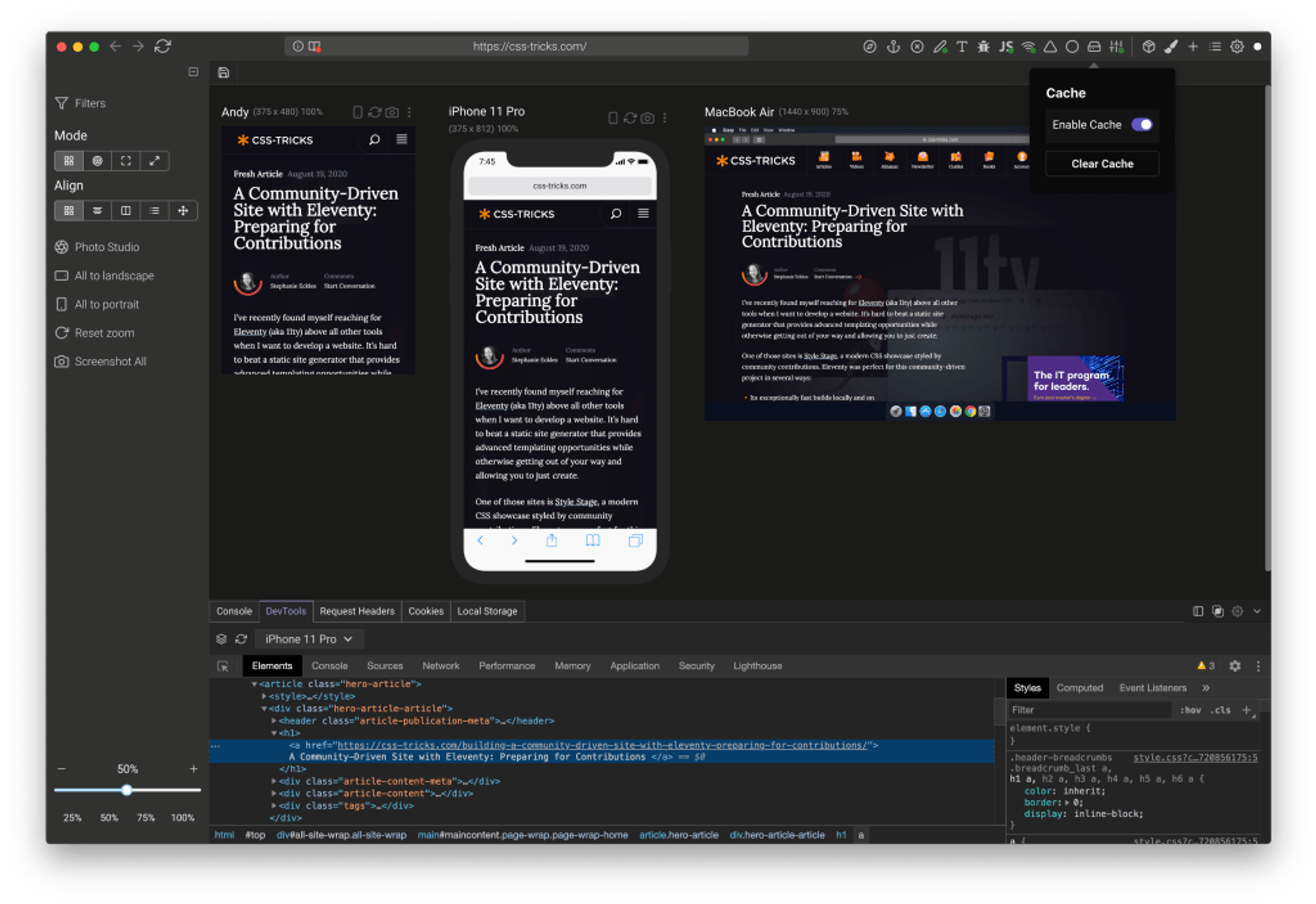
There are a number of these desktop apps where the goal is showing your site at different dimensions all at the same time. So you can, for example, be writing CSS and making sure it’s working across all the viewports in a single glance.
They are all very similar. For example, they do “event mirroring” meaning if you scroll in one window or device, then all the others do too, along with clicks, typing, etc. You can also zoom in and out to see many devices at once, just scaled down. Let’s see if we can root out any differences.
- Windows, Mac, and Linux
- “Solo” plan starts at $5/month and they have plans up from there
There are loads of little cool developer-focused features like:
- Kill a port just by typing in the port number
- There’s a universal inspect mode but, while you can’t apply a change in DevTools that affects all windows and devices at the same time, you can at least inspect across all of them, and when you click, it activates the correct DevTools session.
- Throttle or go offline in a click
- Turn off JavaScript with a click
- Turn on Design Mode with a click (e.g. every element has
contenteditable).
- Toggles for hiding images, turning off all styles, outlining all elements, etc.
- Override fonts with Google Font choices

- Windows, Mac, and Linx
- Open source (Free)
- Universal inspect mode that selects the correct DevTools context
- The option to “Disable SSL Validation” is clever, should you run into issues with local HTTPS.
- One-click dark mode toggle
- Window and Mac
- Free, with premium upgrades ($10/month). Some of the features like scroll syncing and auto refreshing are listed as premium features, which makes me thing that the free version limits them in some way.

- Auto-refresh is a neat idea. You set up a “watcher” for certain file types in certain folders, and if they change, it refreshes the page. I imagine most dev environments have some kind of style injection or hot module reloading, but having it available anyway is useful for ones that don’t.
- There is no universal DevTools inspector, but you can open the DevTools individually and they do have a custom universal inspection tool for showing the box model dimensions of elements.
- There’s a custom error report screen.
- You can enable “Browsing Mode” to turn off all the fancy device stuff and just use it as a semi-regular browser.
- Windows, Mac, and Linux
- Free, with premium plans starting at $10/month. Signing up is going to get you a good handful onboarding emails over a week (with the option to you can opt out).
- It has browser extensions for other browsers to pop your current tab over to Polypane.
- The universal inspect mode seems the most seamless of the bunch to me, but it doesn’t go so far propagate changes across windows and devices. Someone needs to do this! It’s does have a “Live CSS” pane that will inject additional CSS to all the open devices though, which is cool.
- It can open devices based on breakpoints in your own CSS — and it actually works!
- It’s on the Mac App Store for $5, but its website is offline, which makes it seem kinda dead.
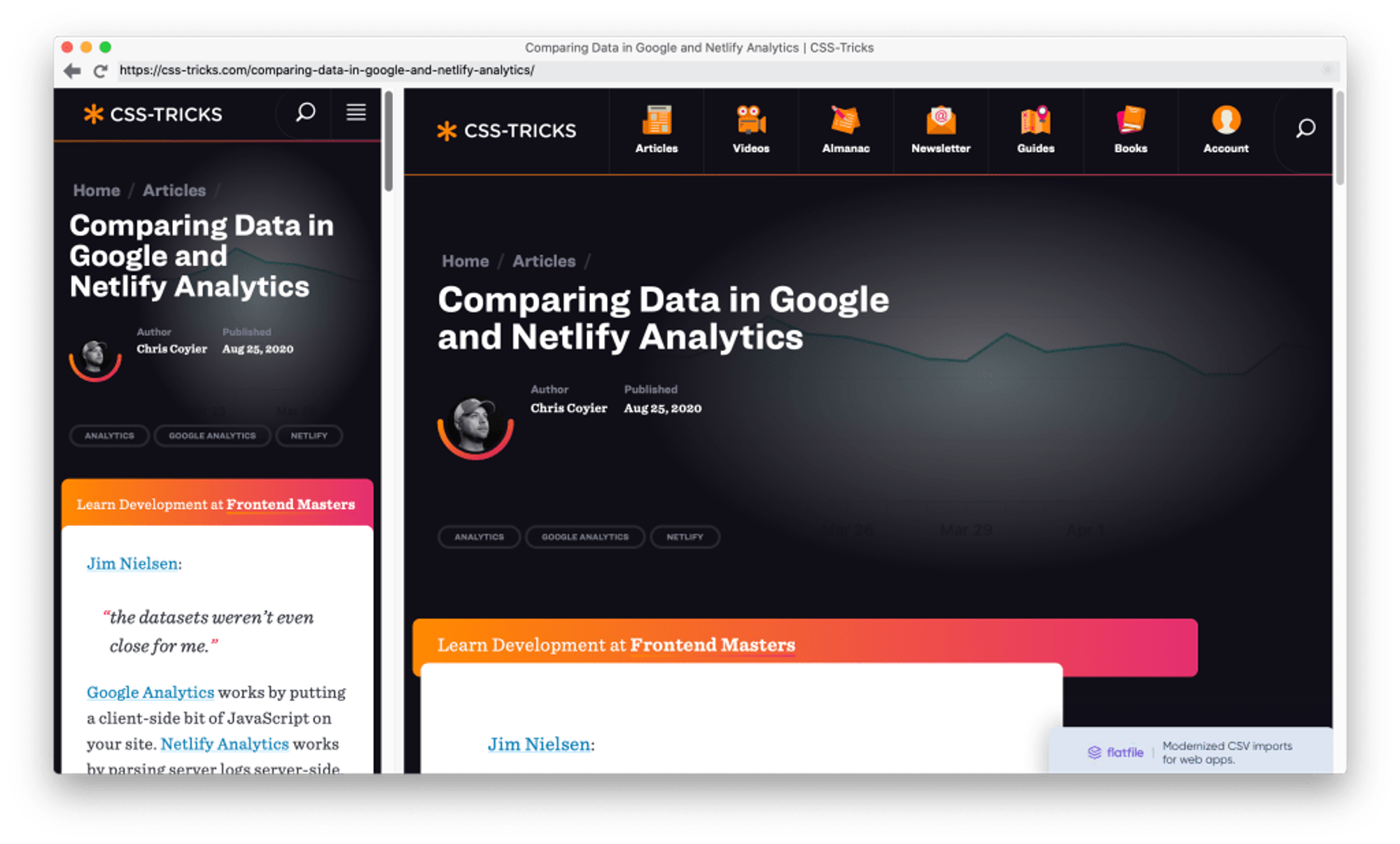
- It has zero fancy features. As the name implies, it simply shows the same site side-by-side in two columns that can be resized.

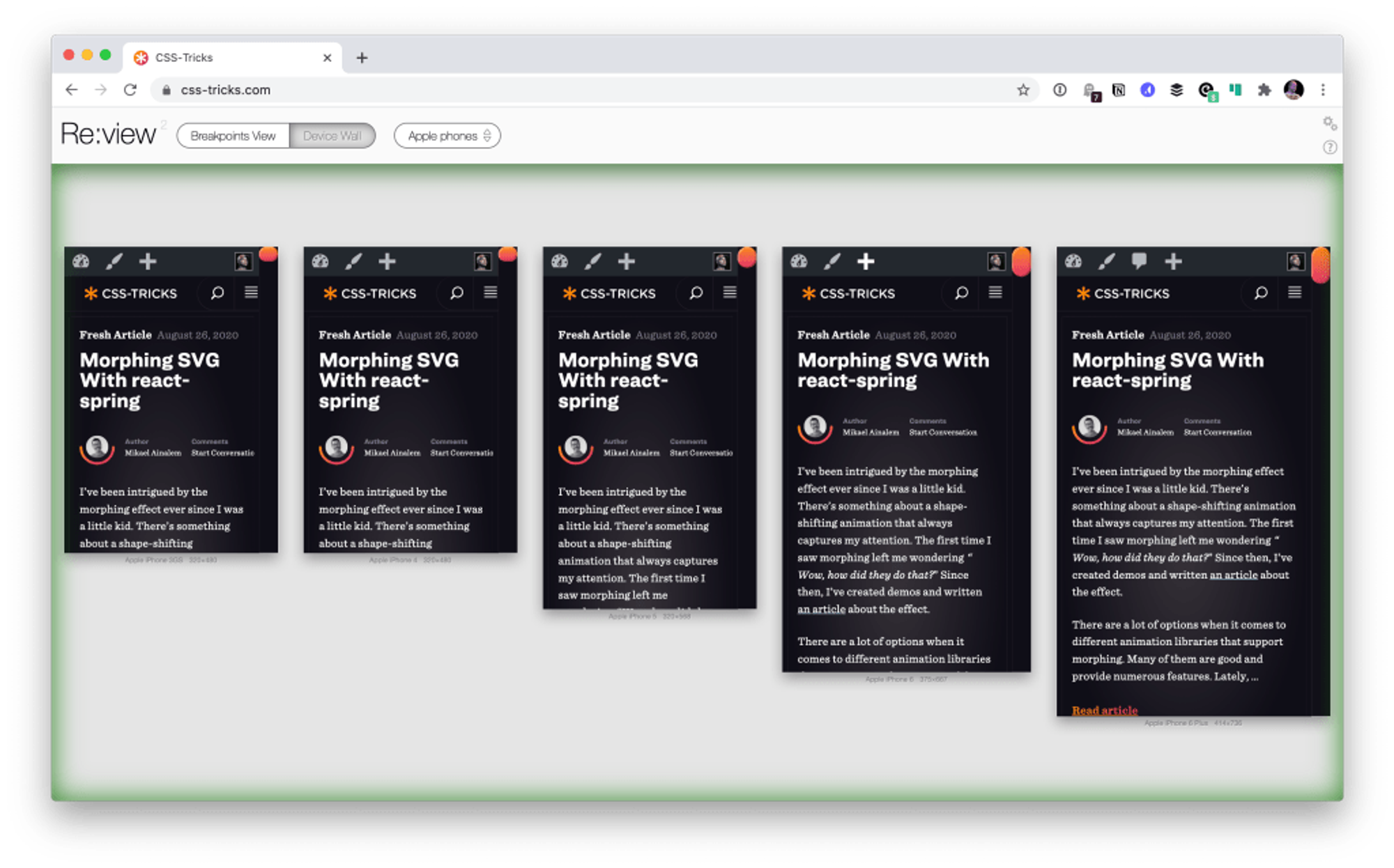
- It’s not a separate browser app, but a browser extension. I kind of like this as I can stay in a canonical browser that I’m already comfortable with that’s getting regular updates.
- The “breakpoints” view is a clever idea. I believe it should show your site at the breakpoints in your CSS, but, it seems broken to me. I’m not sure if this is an actively developed project. (My guess is that it is not.)

What, you want me to pick a winner?
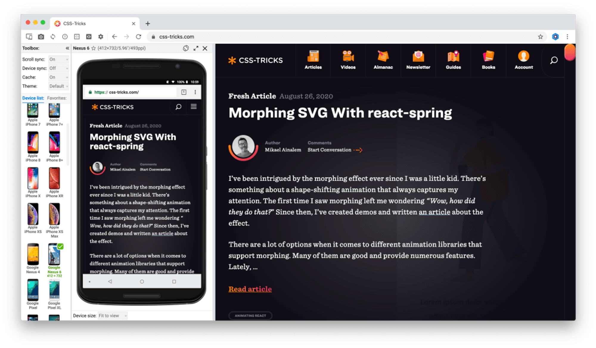
While I was turned off a little Polypane’s hoop jumping and onboarding, I think it has the most well-considered feature set. Sizzy is close, but the interface is more cluttered in a way that doesn’t seem necessary. I admit I like how Blisk is really focused on “just look at the mobile view and then we’ll fill the rest of the space with a larger view” because that’s closer to how I actually work. (I rarely need to see a “device wall” of trivially different mobile screens.)
The fact that Responsively is free and open source is very cool, but is that sustainable? I think I feel safer digging into apps that are run as a business. The fact that I just stay in my normal browser with Re:View means I actually have the highest chance of actually using it, but it feels like a dead project at the moment so I probably won’t. So, for now, I guess I’ll have to crown Polypane.
