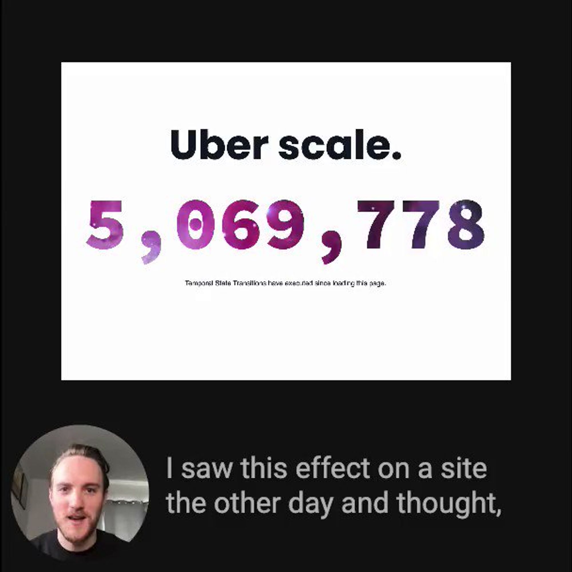
Next, we use these two special CSS properties: -webkit-background-clip will clip that gradient background to only display under the text -webkit-text-fill-color to transparent will make it so that we no longer see the text color, instead only that gradient background behind it
mix-blend-mode in CSS can produce such cool effects, and is so underutilized /* eg: galaxy text effect */ .galaxy-text { mix-blend-mode: lighten; background-image: url(galaxy.png); } More examples & detail 👇
Sorry, your browser doesn't support embedded videos

Here's a cool little playground I made for you to play around with it: builder.io/fiddle/71563ce…
How do you integrate Partytown? You can easily add it to any site with a small snippet, and then tag any scripts that you want to load in the Web Worker with type="text/partytown" partytown.builder.io/html
💡 Web performance tip Optimizing your largest contentful paint (LCP) can be hard Here are 8 tips, with code snippets and visuals, to help your pages load fast for optimal SEO and UX 🧵👇
First, how is LCP measured? > The Largest Contentful Paint (LCP) metric reports the render time of the largest image or text block visible within the viewport, relative to when the page first started loading web.dev/lcp/
As much as possible, serve all pages and content pregenerated from a CDN cache. This ensures that response times are fast, and content can be visible as quickly as possible web.dev/optimize-lcp/#…
The answer has to do with monomorphism: mrale.ph/blog/2015/01/1… In short, JS VMs try to assume a shape of an object using a hidden class. When the shape changes, this can lead to a deopt It's the same reason why setting a property to null/undefined can be faster than deleting:
